Defaults are incredibly interesting. Behind every default choice on a major website is an angry room of people yelling at each other. “Why can’t we move the image up two pixels?!” a Product Manager may say while pounding her fist on the table. “We should move the image down two pixels!!!” a Strategy Analyst may counter. Then chimes in the VP of the Digital team, “why do we even need an image?”
For sites like Facebook and Twitter, defaults aren’t just interesting, they’re the lifeblood of the entire company. What a user first sees when they navigate to a website channels the user’s behavior and interaction with the site. In some instances, 95% of users don’t change or configure anything; they leave the page or application identical to how they found it.
Therefore, when Twitter launched their new homepage (their second homepage change in the past year), I was interested to examine the differences at a microscopic level: what changed, and what implications does this have for users navigating to twitter.com? Furthermore, an understanding of defaults may have dramatic effects on how you interact with pages online! Twitter isn’t the only company that does this: some of the most popular website you use–like Facebook, Google, ESPN, and Wikipedia–test defaults all the time. A lot of times they do this without you even noticing.
So, let’s dive in and explore the new Twitter homepage and see what’s changed.
Old Twitter
We’ll take a look at the “old” Twitter homepage first. There are two cases when a user will see this page: after they navigate to the site for the first time, or after returning to the site while logged out (screenshot of the page below).

Unfortunately, I’m unable to see the exact date ranges for this Twitter.com (http://wayback.archive.org/web/*/http://www.twitter.com), but according to some news articles I dug up it was rolled out to the public in early April 2011 (eight months ago).
There are a few things you should notice on this page.
First, pay close attention to the text copy:
Follow your interests. Instant updates from your friends, industry experts, favorite celebrities, and what’s happening in the world.
Notice the wording: “instant (emphasis mine) updates from your friends, industry experts, favorite celebrities, and what’s happening in the world.” Having “instant” access to unfiltered content is one of the strongest selling points of Twitter and they make no mistake of mentioning it immediately.
Now, observe the difference between the login boxes and the registration boxes. The registration box area is prominently displayed, with bright white backgrounds in the text boxes and a bright yellow button drawing the user’s attention. Conversely, the login area is hidden and more subtle. What does that say? Twitter is more concerned with attracting new users than having users return.
Also pay attention to the languages at the bottom of the page. Twitter lists the languages extremely visibly, as if proudly beating their chest and proclaiming how people from many people of different walks of life use their website.
New Twitter
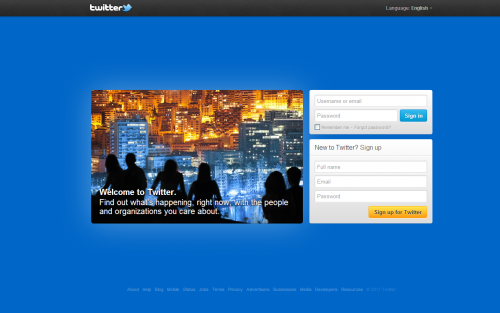
Now, we can move on to the brand, spankin’ new Twitter homepage. For those of you with a careful eye, you’ll notice a couple things–and some very important differences between this page and the old Twitter homepage.
Once again, notice the text copy, which gives us the direction of the new homepage:
Welcome to Twitter. Find out what’s happening, right now, with the people and organizations you care about.
First, notice the headline. “Welcome to Twitter”. Compare this to the previous headline (“Follow your interests”). What was Twitter like eight months ago? Why the difference. Well, Twitter had less traffic and had to convince users to jump on the service. Unlike the current Twitter, there was a lack of name-brand recognition. Whereas in the past, Twitter had to grab the user’s attention with a why (“oh, neat, I can follow the stuff I like on Twitter?”), now users are familiar enough with the Twitter service to want to sign up without a descriptive headline.
Secondly, look at the registration and login boxes. See something different when compared to the old twitter.com? The two boxes are now the same exact size! In older iterations of the homepage, Twitter was more concerned with getting users to sign-up versus sign-in.
However, the headline and registration/login boxes–while important–are likely not what you noticed first: the background and image are probably the most obvious aspects. Having refreshed the home screen a few times, I saw a few different background colors and headline images (taking a page out of Flickr‘s book, perhaps?), as seen below.


So, we have the login/registration boxes, the background color and image, and the text copy changes. There’s one last thing. Notice it? I’ll give you a minute…
…
Find anything yet?
…
The language and bottom (footer) links! The text at the bottom of the page is much more subtle and blends in with the color scheme. The language is now a drop-down menu in the top right-hand corner of the page. With the language and footer much less obvious, it leaves all the attention to three things: the main image; the login box; and the signup box.
In summary, it’s fascinating to see the changes Twitter has made. While many people will glance at the page quickly and sign-up or sign-in without a second thought, there are strong psychological factors in play. As we’ve talked about, the button placement, text copy, and overall layout are incredibly important.
QoD: What do you think of the new Twitter homepage?